Textkiller
Following the successful evolution of Robokiller, we turned our focus to its sibling app: Textkiller, an AI-powered tool designed to block spam texts. The goal was clear: create a distinctive, modern brand identity that would resonate with younger users, while still aligning with the broader Teltech telecommunications portfolio.
This rebrand wasn’t just cosmetic. It was an opportunity to position Textkiller as a standalone product with a strong, clear purpose—cutting through digital noise and restoring user control.
Recognition
🏆 Gold Winner – Best Use of AI and Machine Learning Stevie Awards, 2023
Outcomes
Successfully positioned Textkiller as a standalone product within the Teltech suite
Improved UX and clarity through brand-led interface design
Boosted engagement and stronger user retention post-rebrand
Brand consistency is maintained across Robokiller and the broader app ecosystem


The Challenge
Textkiller had powerful technology behind it—but no visual identity, brand voice, or cohesive product experience.
We needed to:
Attract a younger, design-conscious audience with fresh, engaging visuals
Align the identity with the established Robokiller ecosystem without feeling like a clone
Integrate brand and product seamlessly—from onboarding flows to marketing assets
Communicate protection, clarity, and trust without resorting to fear-based messaging
The brand had to feel clean, confident, and modern, without losing the warmth and approachability that had made Robokiller a success.


The Process
Research & Audience Insights
We began with deep audience analysis, focusing on younger users’ visual preferences, digital habits, and trust triggers. We looked closely at competitors and broader mobile trends to ensure Textkiller stood apart, not just in what it did, but how it felt.
Brand Identity Development
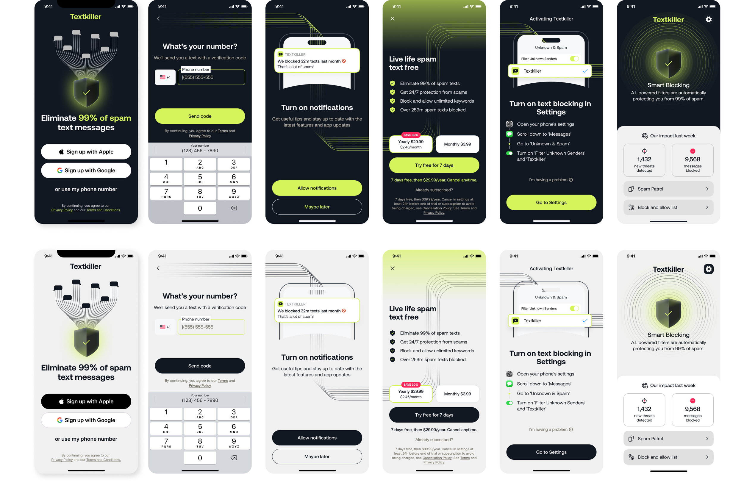
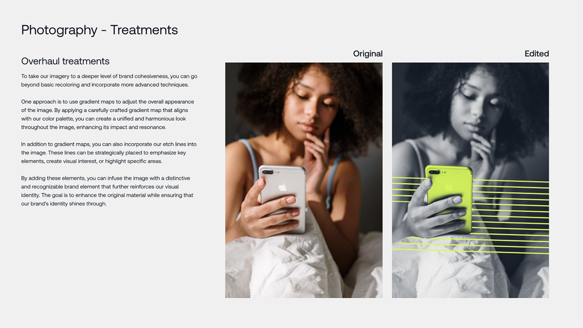
We developed a flexible new brand system rooted in a bold but minimal visual language. The cornerstone was the ‘Etch’ line motif, a subtle graphic element representing the idea of cutting through digital clutter. This motif unified everything from UI elements to marketing layouts.
Logo & Typography: A clean, typographic wordmark paired with accessible, modern typefaces.
Colour Palette: A crisp, youthful palette to feel both fresh and secure.
Illustrations & Graphics: Minimalist, flat-style visuals layered with subtle motion for digital environments.
Product Design Integration
We applied the brand system directly to the app’s UI. This included:
Streamlined onboarding flows
Legible, scalable typography
Clear visual hierarchy for message scanning and actions
Interaction moments that reinforced the brand’s tone of quiet confidence
Tone of Voice & Messaging
Textkiller’s messaging needed to walk a fine line: alert but not alarmist. We developed a voice that was calm, direct, and supportive—especially in onboarding, alerts, and empty states.
System Flexibility
The identity was built to scale, with adaptable elements designed to work across:
In-app UI
Website and landing pages
Social and App Store assets
B2B and portfolio-level materials


Reflections
What made this project uniquely rewarding was the opportunity to define a brand from the ground up, while embedding that identity directly into the user experience. Textkiller is now more than a utility—it’s a product with personality, purpose, and staying power.
This work helped lay the foundation for a future-facing Teltech suite—one where each product is distinct, yet unmistakably part of a larger, unified ecosystem.