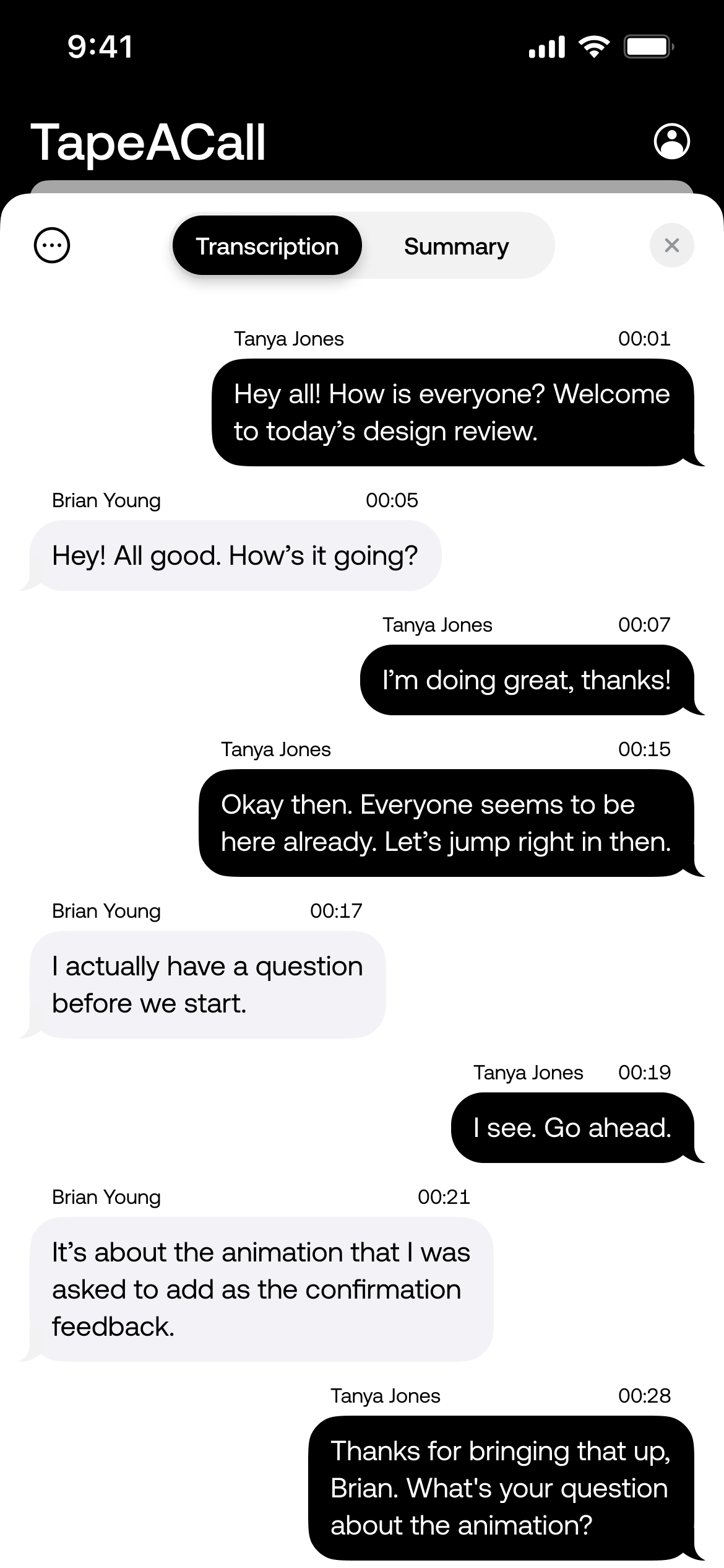
TapeACall
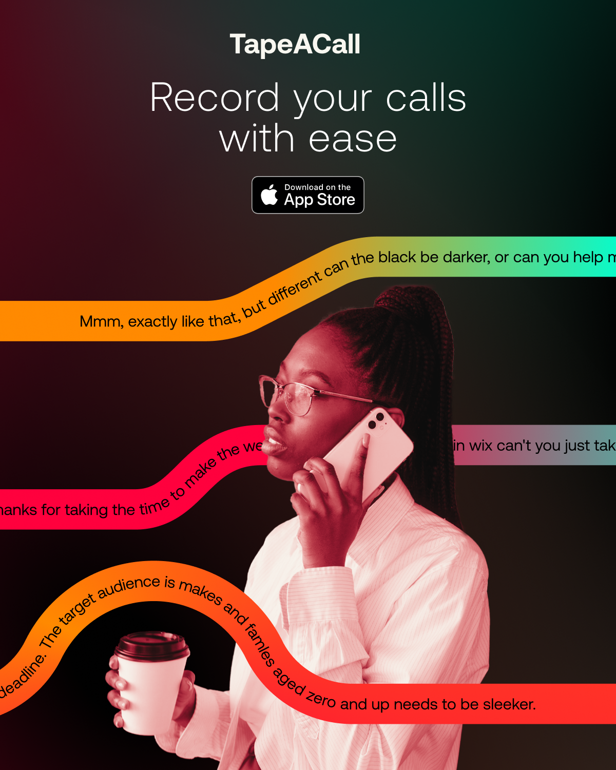
TapeACall is built on a deceptively simple yet powerful premise: when you’re fully present in a conversation, everything works better. Though technically reliable, TapeACall’s brand had long been rooted in pure utility. It lacked emotional resonance and struggled to stand out beyond its function.
Our challenge was to reimagine it as a calm, modern companion—less transactional, more essential, reframing it as a tool not just for recording, but for remembering, connecting, and staying focused.
Outcomes
25.7 Million+ Calls Recorded
3.73 Million+ Hours of Recordings
205,000+ Transcriptions Processed


The Challenge
TapeACall had a solid foundation as a call recording app, used by professionals and everyday users alike. But the brand felt clinical, practical, and uninspiring. The identity didn’t reflect the emotional context in which people use the product: to remember important conversations, reduce mental clutter, and remain present.
We needed to:
Reposition the app from a functional recorder to a mindful productivity aid
Establish an identity that evoked calm, trust, and clarity
Modernise the visual system without alienating the existing user base
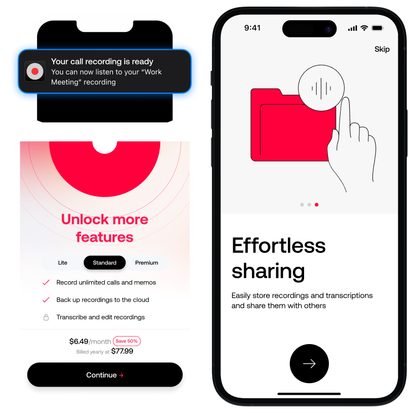
Create a design system adaptable across UI, marketing, and App Store assets


The Process
Research & Strategy
We began by analysing the emotional context in which people use TapeACall—looking at themes of memory, productivity, and trust. We conducted competitor audits and user interviews to understand expectations and uncover opportunities to differentiate.
Reframing the Brand
The repositioning centred around one idea: presence. We moved away from the cold, functional identity and repositioned TapeACall as a tool for peace of mind and productivity—a way to stay engaged in the moment without worrying about what might be forgotten.
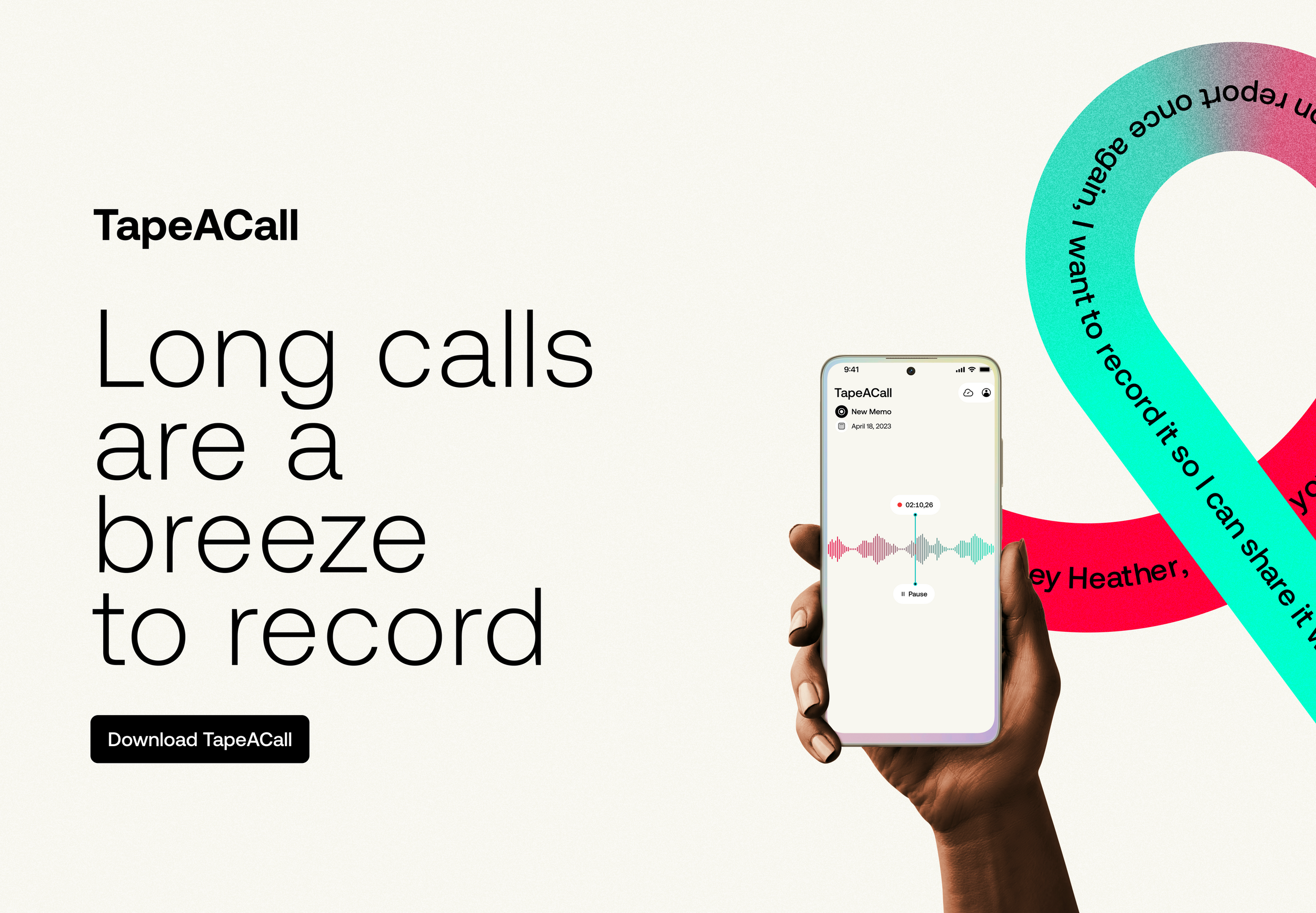
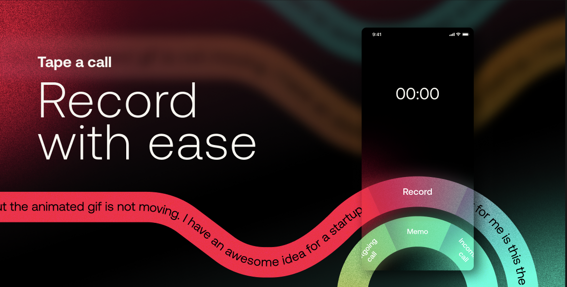
Visual Identity Development
We introduced a modern, refined aesthetic built on these principles:
Logo refresh – simplifying the mark for clarity and versatility
Calm, intentional palette – soft neutrals with a focused accent to convey quiet confidence
Whitespace and layout – creating space for focus and ease of interaction
Typography – clear, legible type choices to reinforce accessibility and professionalism
‘Invisible design’ philosophy – minimal ornamentation, maximum usability
System Integration
The design system was crafted to scale across:
Product UI
Marketing and social content
App Store screenshots and promo assets
Future brand campaigns
We built a modular system that could evolve with the product, offering flexibility while maintaining consistency.
Messaging & Tone
The brand voice was adjusted to reflect the product’s shift from tool to companion. We focused on reassurance, presence, and simplicity, supporting users without overwhelming them.