iTranslate
As a leading translation app enabling communication in over 100 languages, iTranslate offers powerful, nuanced functionality—but this richness sometimes makes it feel overwhelming to the everyday user.
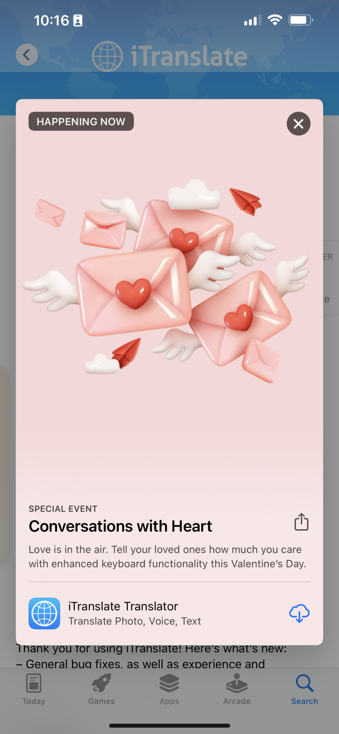
In collaboration with the marketing team, I created App Store screenshots and promotional materials that not only highlighted iTranslate’s most compelling features but also reinforced its core mission: empowering seamless global communication.
Recognition
🏆 Webby Award Winner – Learning & Education, Apps & Software, 2024
🏆 Consistently ranked among the top translation apps globally 500K+ App Store reviews and sustained category leadership
Outcomes
Increased App Store conversion rates through benefit-led screenshot storytelling
Reinforced the brand’s global mission with clear, human-centred visuals
Enhanced product understanding, especially for first-time users
Aligned product capabilities with emotional value: empowering communication, reducing friction
The Challenge
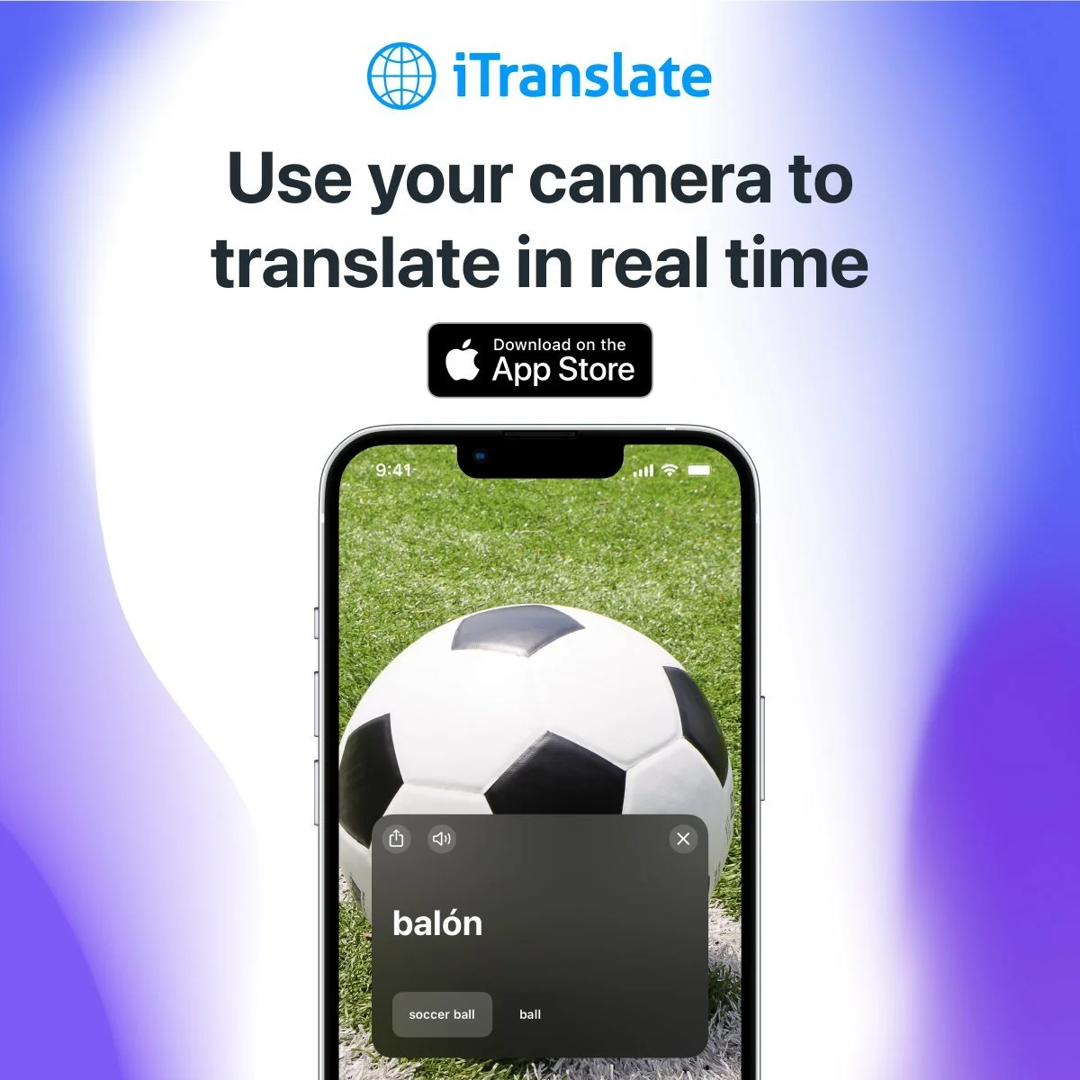
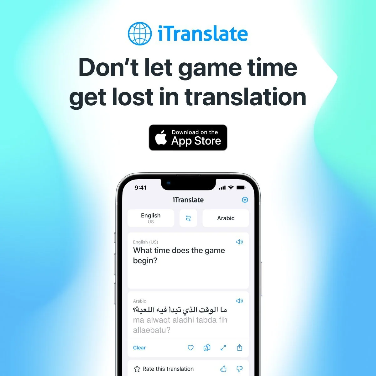
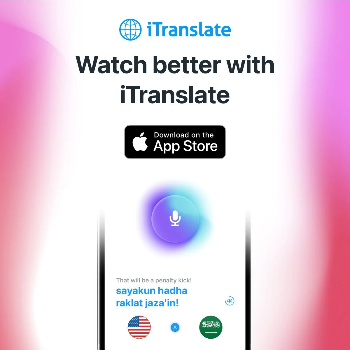
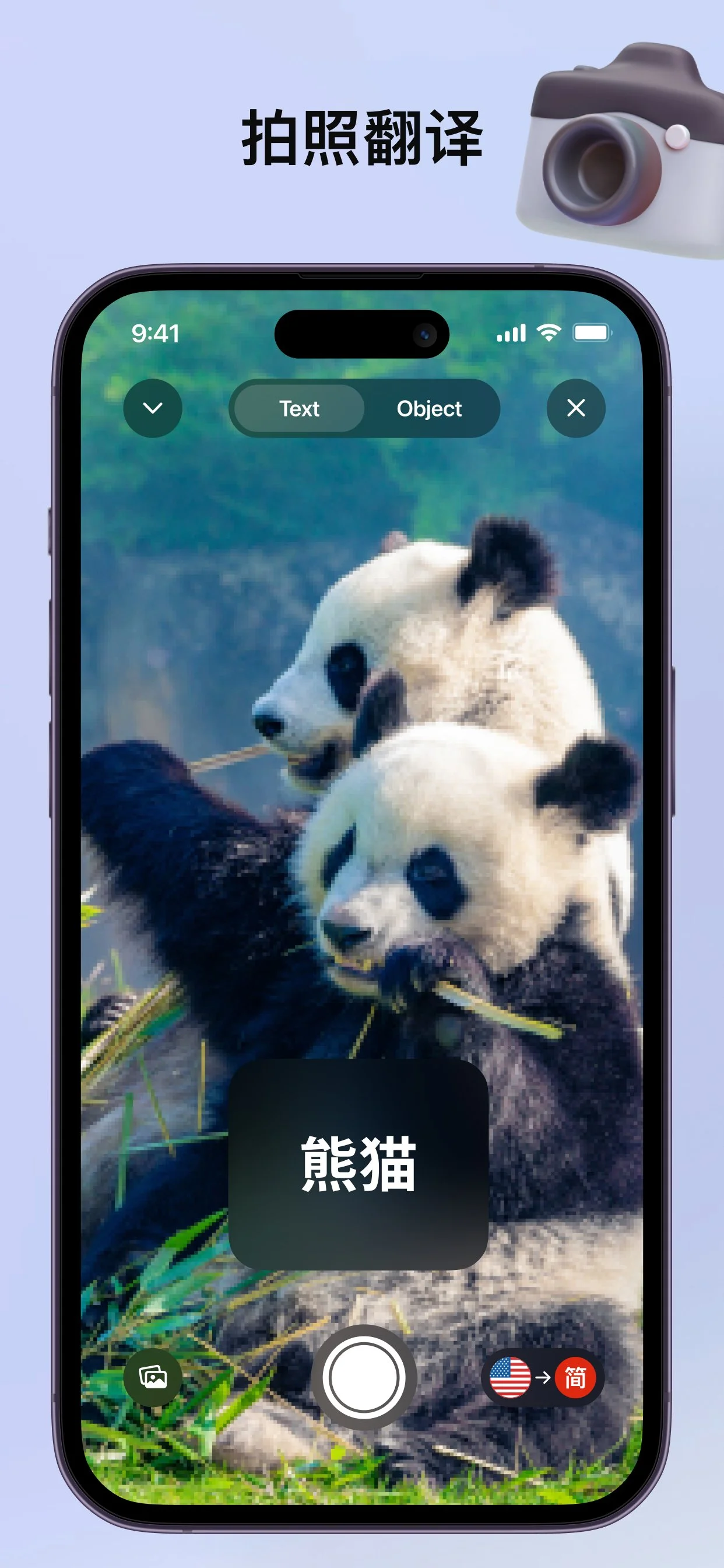
Despite offering advanced features—automatic language detection, voice input, and dialect switching—iTranslate struggled with user conversion in a crowded app marketplace. The product was technically impressive, but its marketing visuals lacked clarity and emotional appeal, resulting in missed opportunities to capture new users.
We needed to:
Create visually engaging, benefit-focused App Store assets
Improve feature comprehension for first-time users
Align promotional content with the brand’s global mission
Boost engagement and conversion in competitive marketplaces


The Process
Research & Strategy
We began by analysing:
iTranslate’s target audience (travellers, students, multilingual professionals)
Market trends and competitor visuals in the translation app space
Key pain points for onboarding and visual clarity
This helped us identify the most valuable features to highlight—and the best visual approaches to make them feel approachable.
Conceptualisation
From there, I sketched and drafted concepts for App Store visuals and digital assets. I focused on:
Clean, modular layouts to emphasise feature clarity
Inclusive, global imagery to reflect the diverse user base
UI demonstrations that showed the ease of translation in action
Design & Iteration
I created multiple iterations of each asset, experimenting with:
Typography hierarchy to emphasise benefits, not just features
Colour palette refinements to reflect brand warmth and accessibility
Iconography and illustrations that simplified complex interactions
Through feedback sessions with the team, I refined the assets to meet both marketing objectives and user needs.


Reflections
What made this project uniquely rewarding was the opportunity to define a brand from the ground up, while embedding that identity directly into the user experience. Textkiller is now more than a utility—it’s a product with personality, purpose, and staying power.
This work helped lay the foundation for a future-facing Teltech suite—one where each product is distinct, yet unmistakably part of a larger, unified ecosystem.