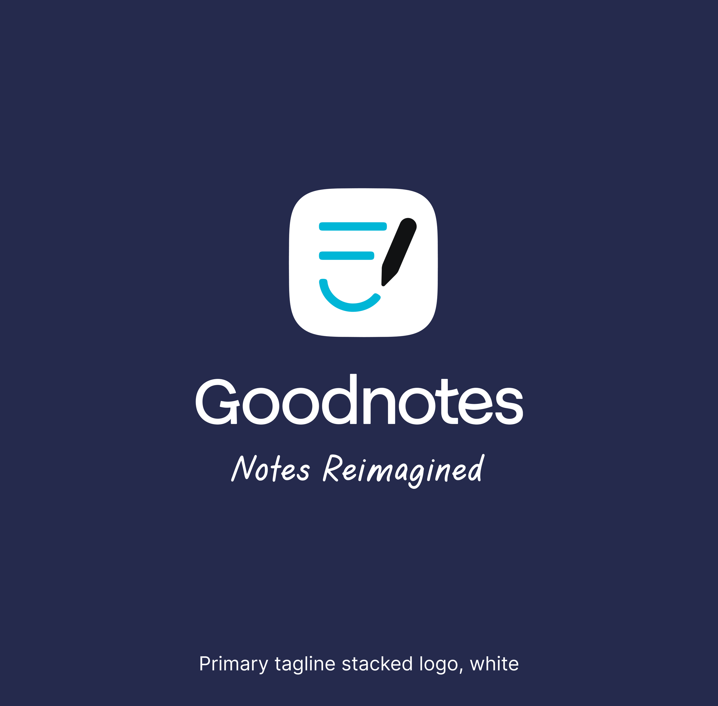
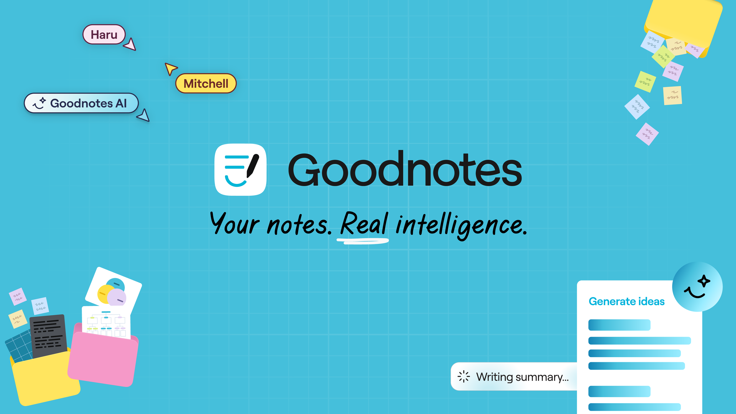
Goodnotes
Evolving a beloved brand for a broader, more ambitious future. Goodnotes has grown from a digital notebook for students into a productivity platform relied upon by creators, researchers, professionals, and entire organisations. The identity, however, hadn’t fully caught up. This rebrand was not about reinventing what people loved, it was about evolving it with care, ensuring the logo and visual system reflected who Goodnotes had become.
Recognition
🏆 2025 App of the Day – Apple
🏆 2025 Editor's Choice – Apple
🏆 2025 Best for Large Screens – Google Play
🏆 2022 App of the Year – Apple
Outcomes
The refined logo mark strikes the right register: friendlier than corporate, more intentional than playful - a visual space where handwriting warmth meets digital precision.
The launch rollout strengthened Goodnotes’ presence across global platforms while the improved internal systems empowered faster delivery, consistency, and collaboration.
This rebrand laid the foundation for Goodnotes’ next chapter: a productivity platform trusted by thinkers, learners, and professionals around the world.
The Challenge
Refresh the Goodnotes identity so it resonates not only with students and educators, but also with lawyers, architects, engineers, detectives, and knowledge workers - without losing the friendly warmth that defines the brand.
The task demanded thoughtful restraint: modernise the logo while protecting recognition, equity, and emotional familiarity.


The Process
Understanding the Shift
Goodnotes needed an identity that honoured its academic roots, while meeting the sophistication of its expanding user base. We explored how the logo lived in people’s minds, not just on screens, testing possibilities against real contexts to identify what must stay true.
Design Evolution, Not Reinvention
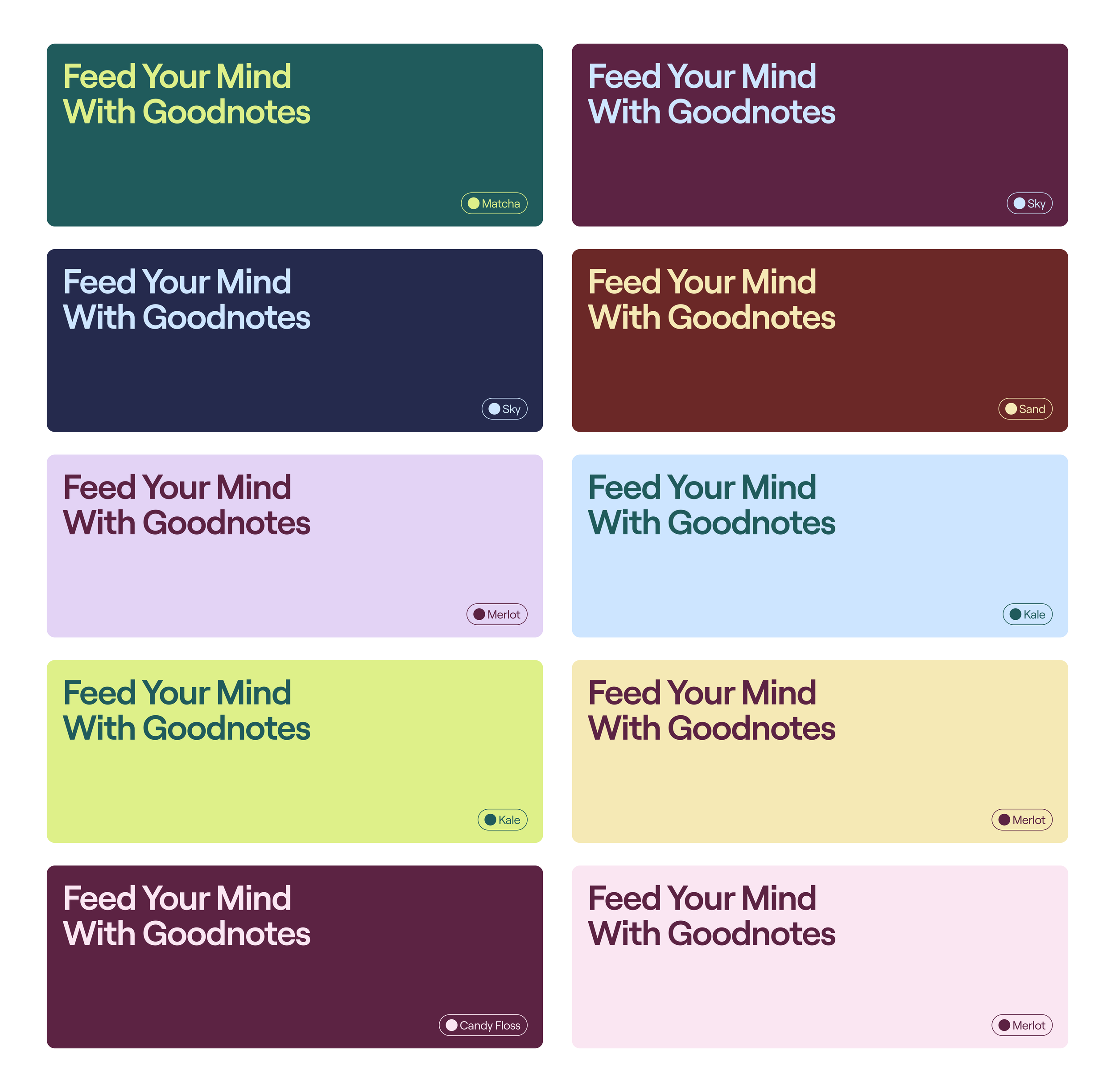
This rebrand centred on precision rather than novelty. Key refinements included:
Rebalancing the symbol by reducing the pen size - evening visual weight and clarity.
Adjusting internal spacing for calmer legibility at smaller scales.
Subtly reshaping the container for a more dynamic but familiar silhouette.
Refining the smile line, removing its “chubby cheek” to strike a more mature tone that bridges student and professional audiences.
Crucially, the word mark remained untouched - a deliberate decision rooted in equity and effectiveness. Successful evolution often means knowing what not to change.
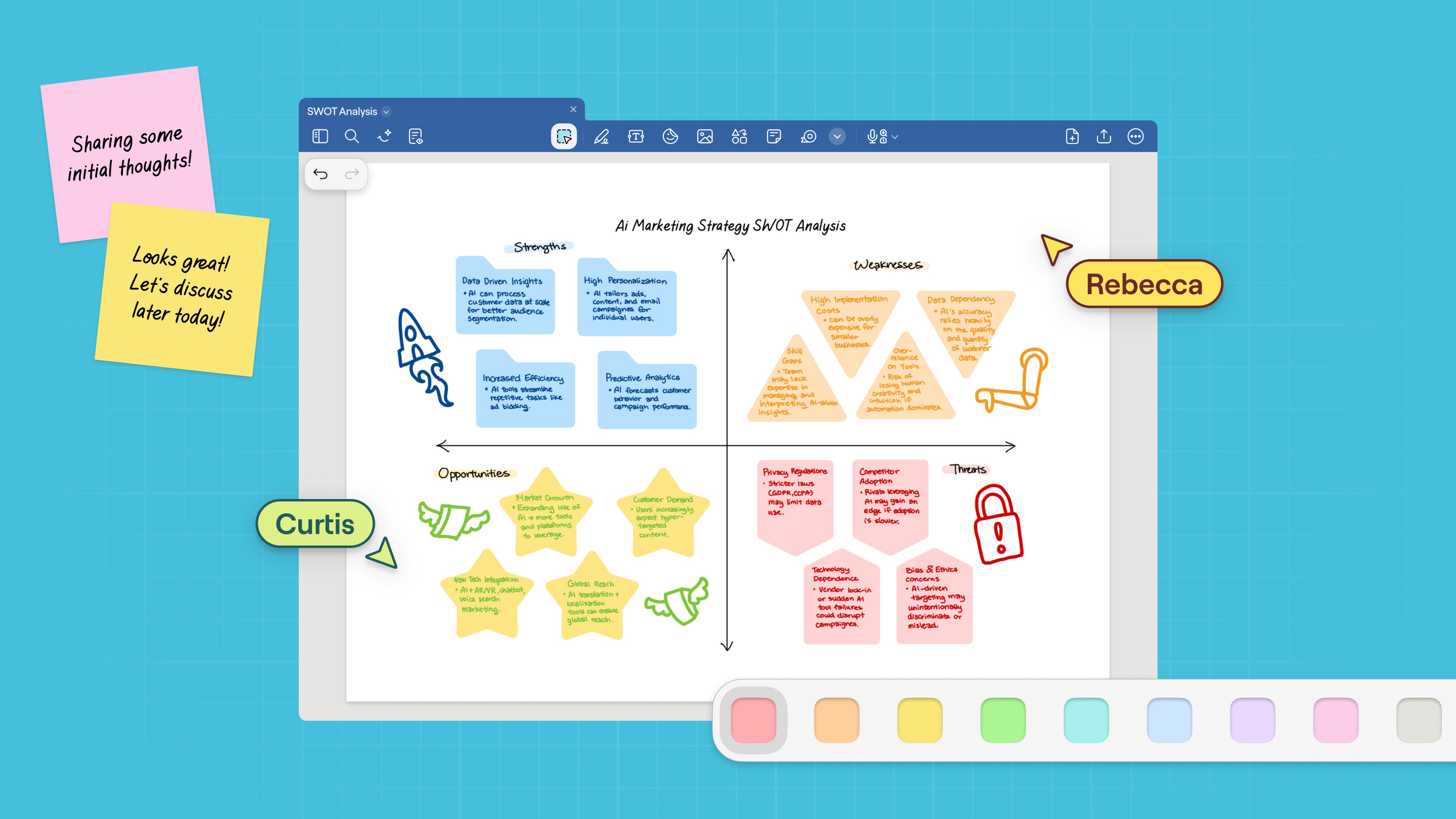
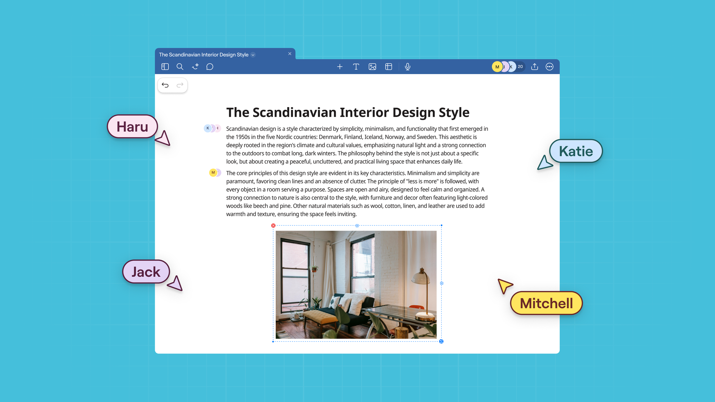
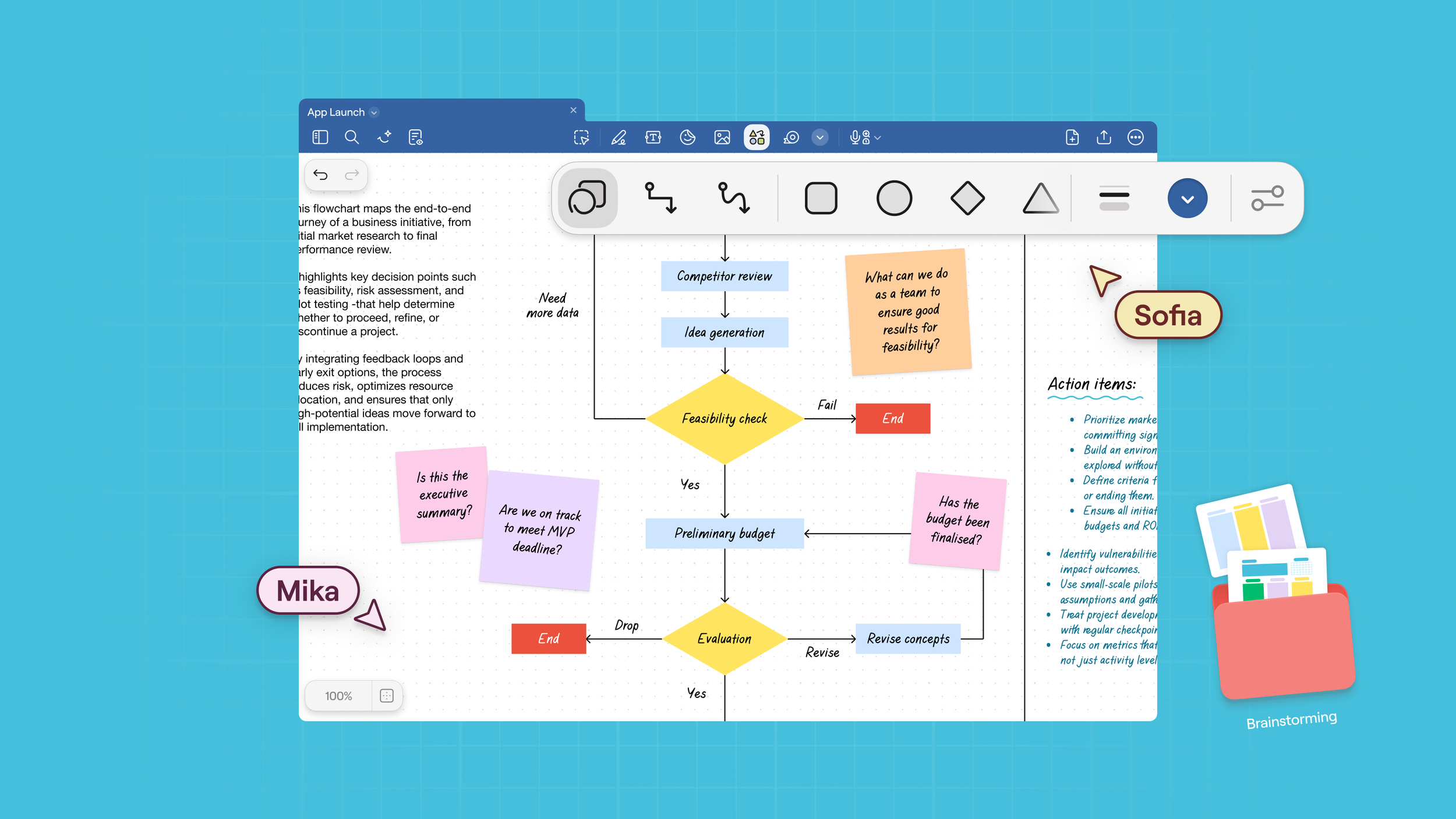
Execution Across Ecosystems
This work lived far beyond a logomark.
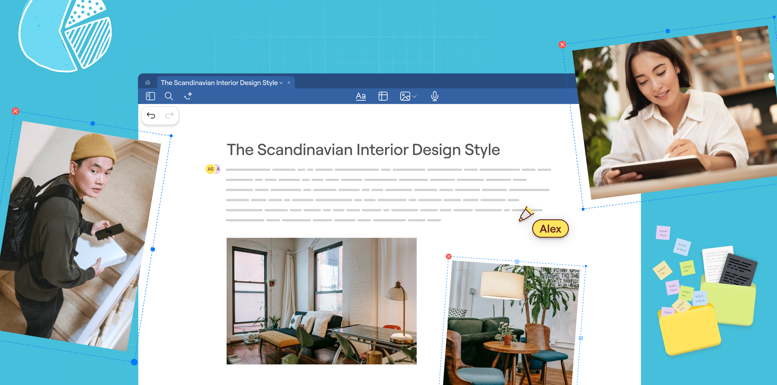
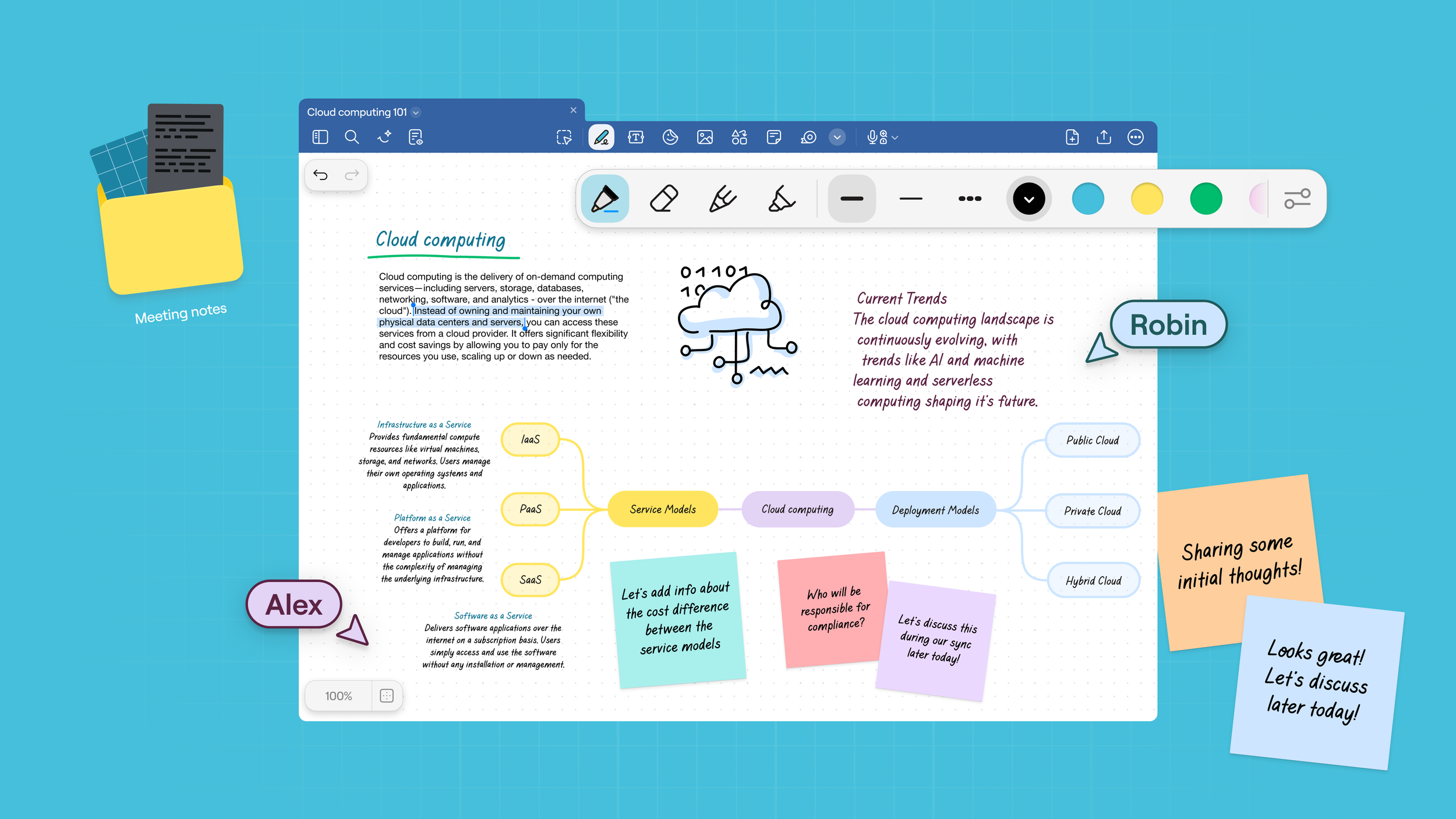
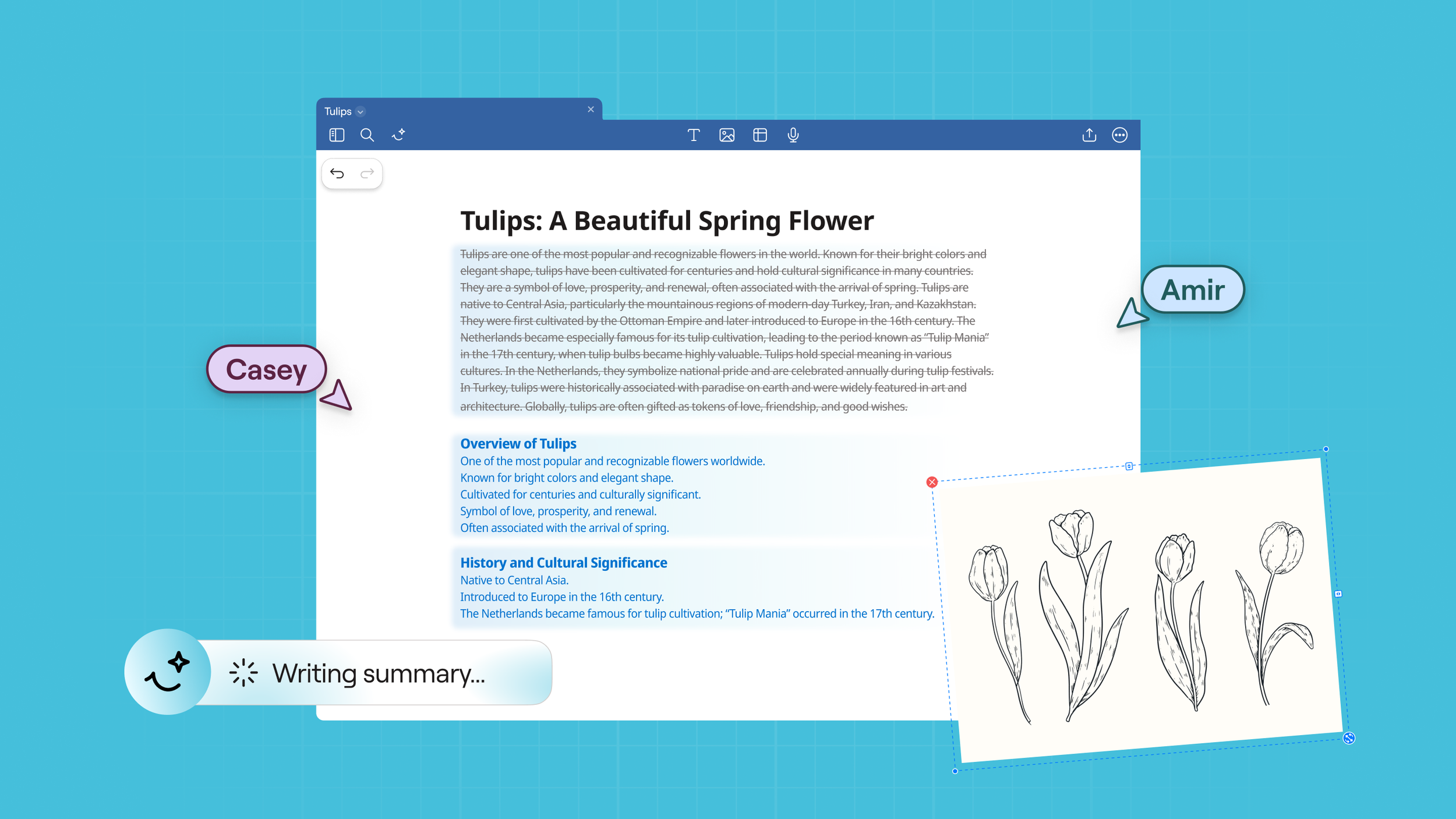
I led the end-to-end creation and delivery of our App Store and cross-platform experience assets, including:
Full screenshot suites for iPhone, iPad, and Mac across 15 languages
Assets for Microsoft Store and Google Play across 5 languages
Working under tight deadlines, I navigated last-minute UI changes to ensure consistency, accuracy, and a cohesive launch experience across global platforms.
Reflections
Rebranding Goodnotes reinforced one key truth: continuity is harder than change.
The work wasn’t about redesigning for novelty, it was about guiding the brand forward while preserving the feelings people already held for it.
The biggest learning? Strong brands don’t ask, “What should we change?” - they begin with, “What must remain?”