Good Future Foundation
The Good Future Foundation needed a clear, accessible brand identity and website to support its mission of closing the tech gap in education. Our challenge was to create a digital presence that was approachable, inclusive, and future-focused, ensuring educators and students from all backgrounds could engage with the Foundation’s resources and message.
Outcome
The result was a cohesive, accessible brand system and website that elevated the Good Future Foundation’s credibility and reach. The inclusive, approachable design made their mission more tangible—empowering a diverse audience to engage with tools, insights, and resources for an AI-powered educational future.
The new visual identity supports the Foundation’s growth and advocacy efforts, setting the tone for a more equitable and digitally fluent generation of learners and educators.


The Challenge
Create a cohesive, user-friendly brand and website that communicates the Foundation’s mission of accessibility and AI preparedness, while ensuring visual clarity, inclusivity, and ease of navigation for a broad audience.


The Process
Mission-Led Research
We began by deeply understanding the Foundation’s goals and audience, specifically the needs of under-resourced educators and students navigating a rapidly evolving tech landscape.
Concept Development
Our visual exploration centred on themes of trust, openness, and future-readiness. We explored how design could serve both transparency and warmth, reflecting the Foundation’s commitment to inclusion.
Brand Identity Design
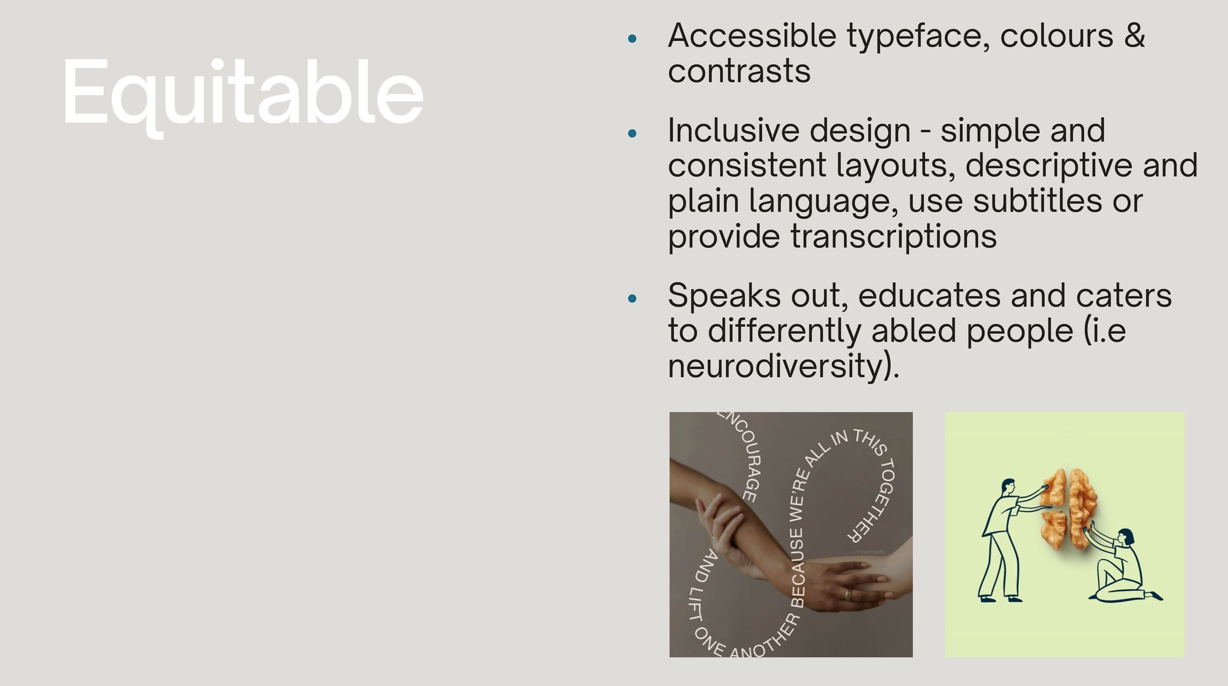
We developed a clean, accessible identity system featuring:
A highly legible, modern typeface
A calm, optimistic colour palette prioritising contrast and accessibility
Friendly illustrations to humanise the brand and engage younger users and educators alike
Website Design & Architecture
We built a streamlined, intuitive website structure with:
Clear information hierarchy and navigation
Accessible design patterns, optimised for screen readers and mobile
Thoughtful use of whitespace and iconography to reduce cognitive load


Reflections
This project reinforced the power of simplicity in design, especially when paired with intentional accessibility choices. Designing for clarity and inclusion isn’t about doing less; it’s about being more deliberate.
Collaborating closely with mission-driven stakeholders was a reminder that good design can quietly empower change without demanding attention. This project was a meaningful intersection of purpose and craft, and a strong example of how design can bridge the gap between emerging technology and human need.